I’m no typographer but I do like a nice typeface – and I appreciate it when people pronounce typeface names correctly. Hardly the most pressing matter you’ll ever encounter, but hey.
Here is a pronunciation guide to a few typefaces, using CAPITAL letters for the syllable that needs to be stressed.
Example: say “table” as TAY-bul.
Arial
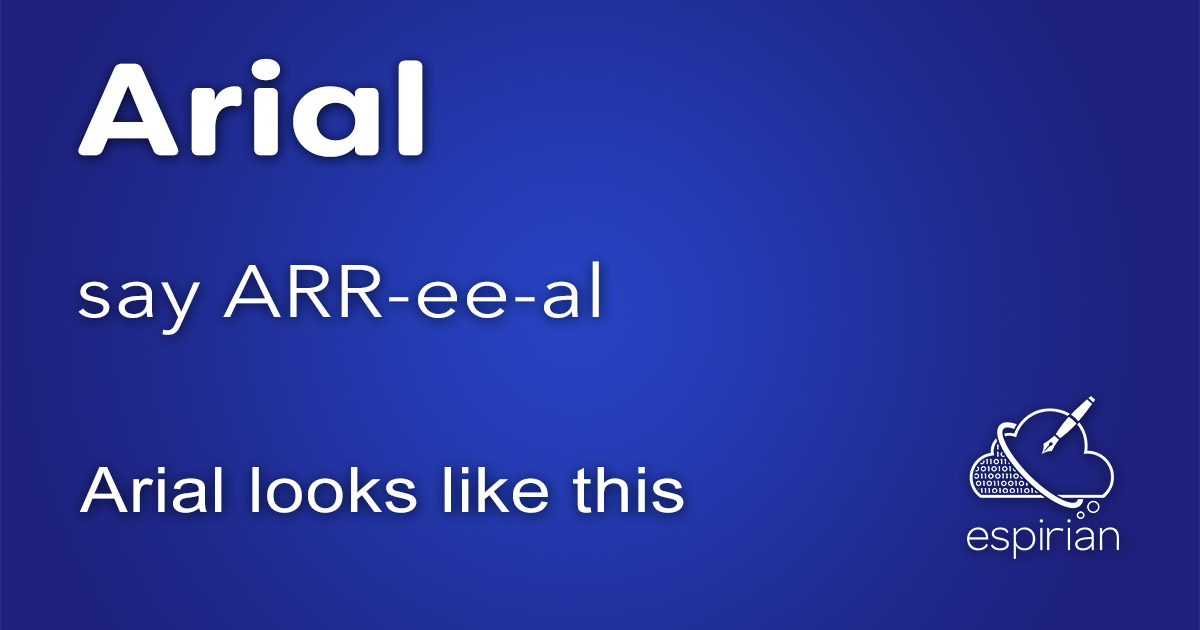
This is one of the most common typefaces. Everyone knows it but very few pronounce it correctly.
Say it as ARR-ee-al.
A lot of people say AIR-ee-al. Save that pronunciation for the words “aerial” (an antenna or something that happens in the air) and “Ariel” (the Little Mermaid).
Memory hack: Arial is a pirate’s favourite typeface. ARR!
(Some people do still believe that it really ought to be AIR-ee-al. Well, the Adobe Grandmaster who trained me insists that ARR-ee-al is correct. That’s good enough for me!)
Verdana
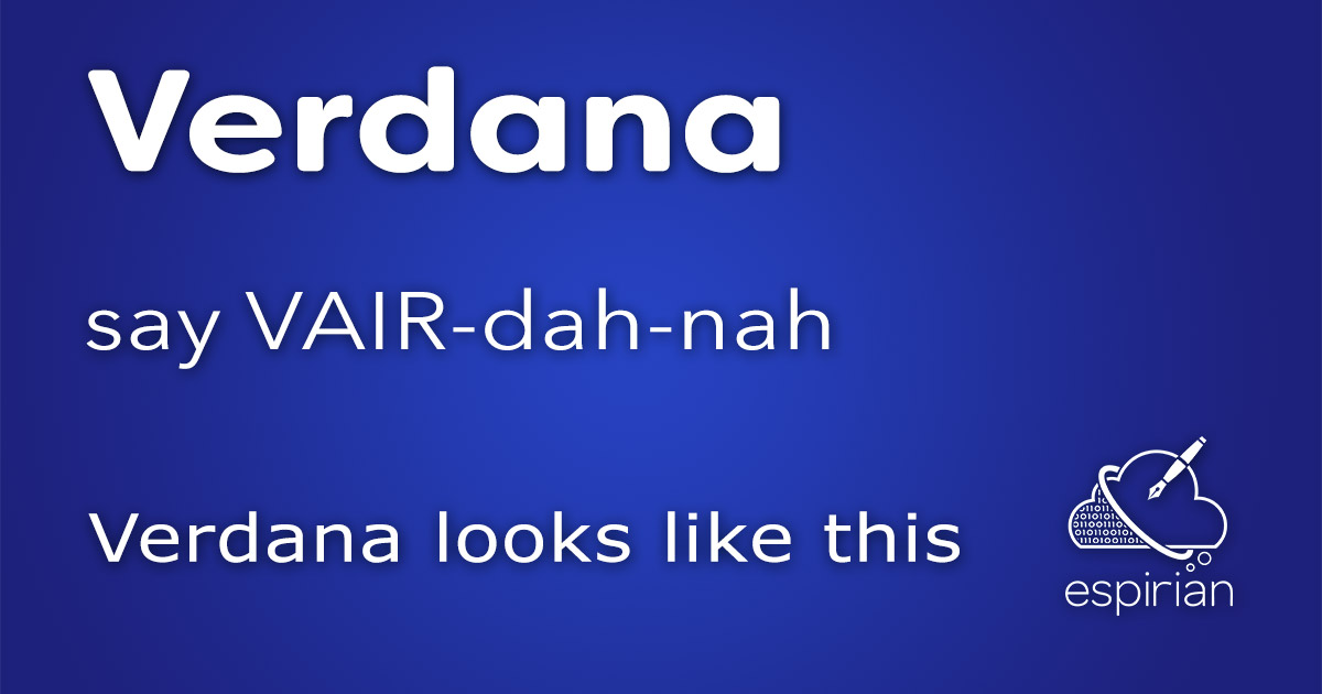
This is an easy one to pronounce.
Say it as VAIR-dah-nah.
But don’t confuse it with “veranda”, which is a roofed platform along the outside of a house.
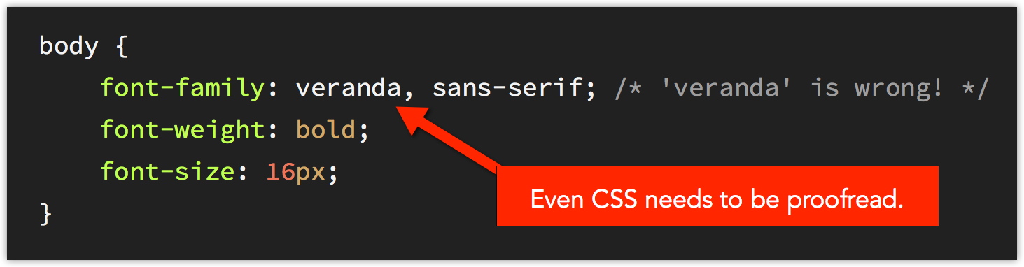
I saw this when checking a CSS file the other day:
I posted about this on Twitter:
Even CSS needs to be proofread sometimes: have just seen one stylesheet with its typeface set to ‘Veranda’.
— John Espirian (@espirian) March 11, 2016
Some people responded to say they thought the typeface really was called “veranda”. This isn’t a mistake you want to make when talking to a designer!
Helvetica Neue
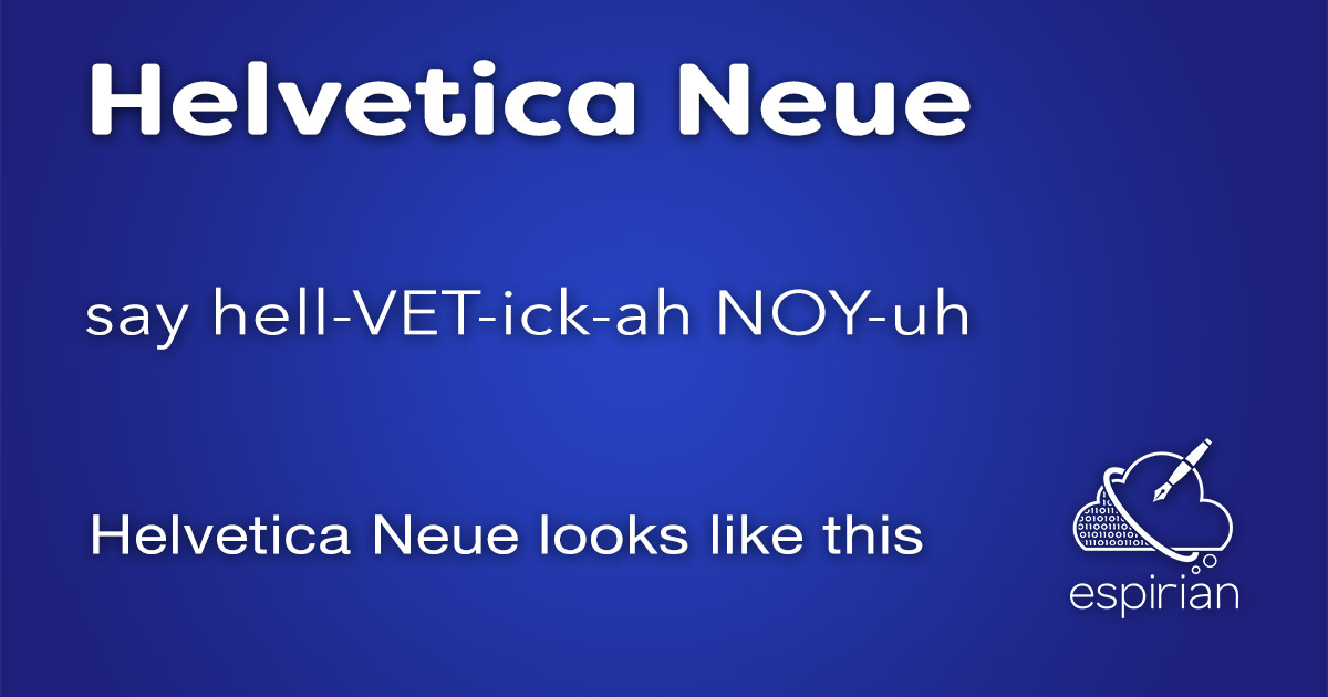
For a long time, this was one of my favourite typefaces.
Say it as hell-VET-ick-ah NOY-uh.
Avenir
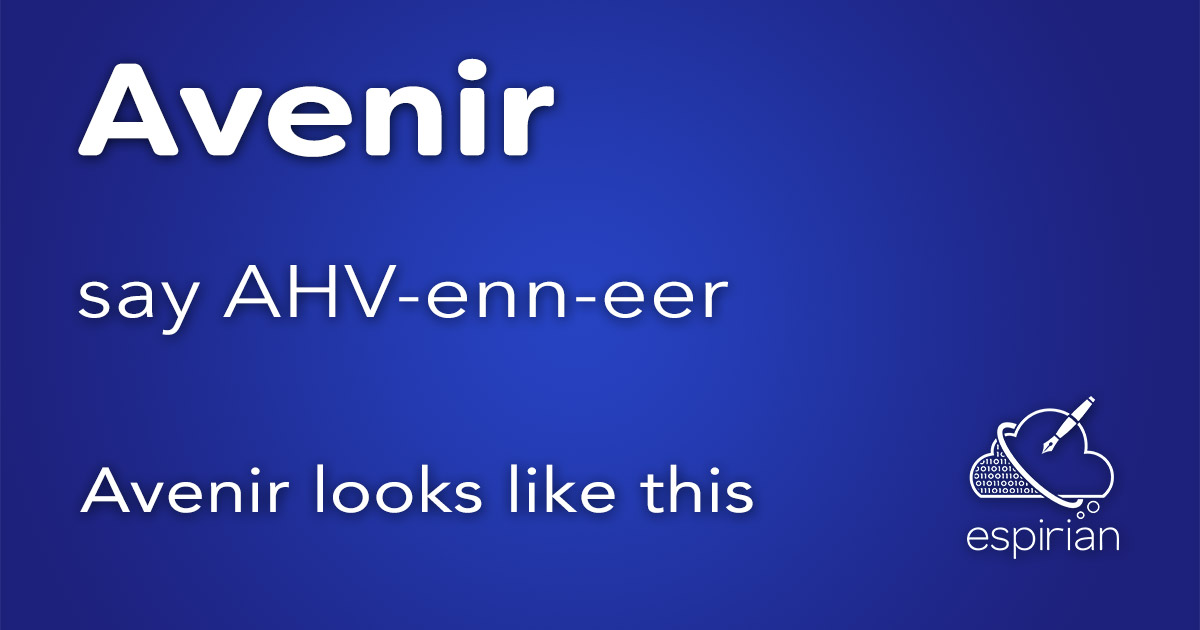
This used to be my favourite typeface and was what I used in the body copy of espirian.co.uk for many years. I’ve since switched to Montserrat.
Say it as AHV-enn-eer.
Avenir means “future” in French. I like that.
Trebuchet
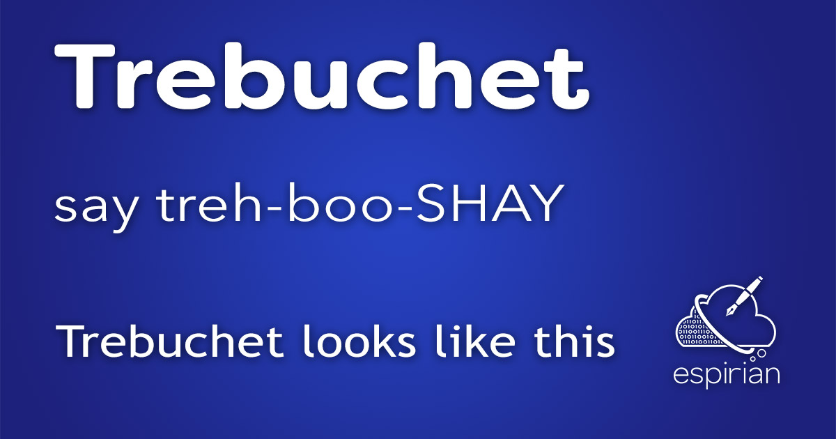
Another common one, though not as common as it once was.
Say it as treh-boo-SHAY.
Comic Sans
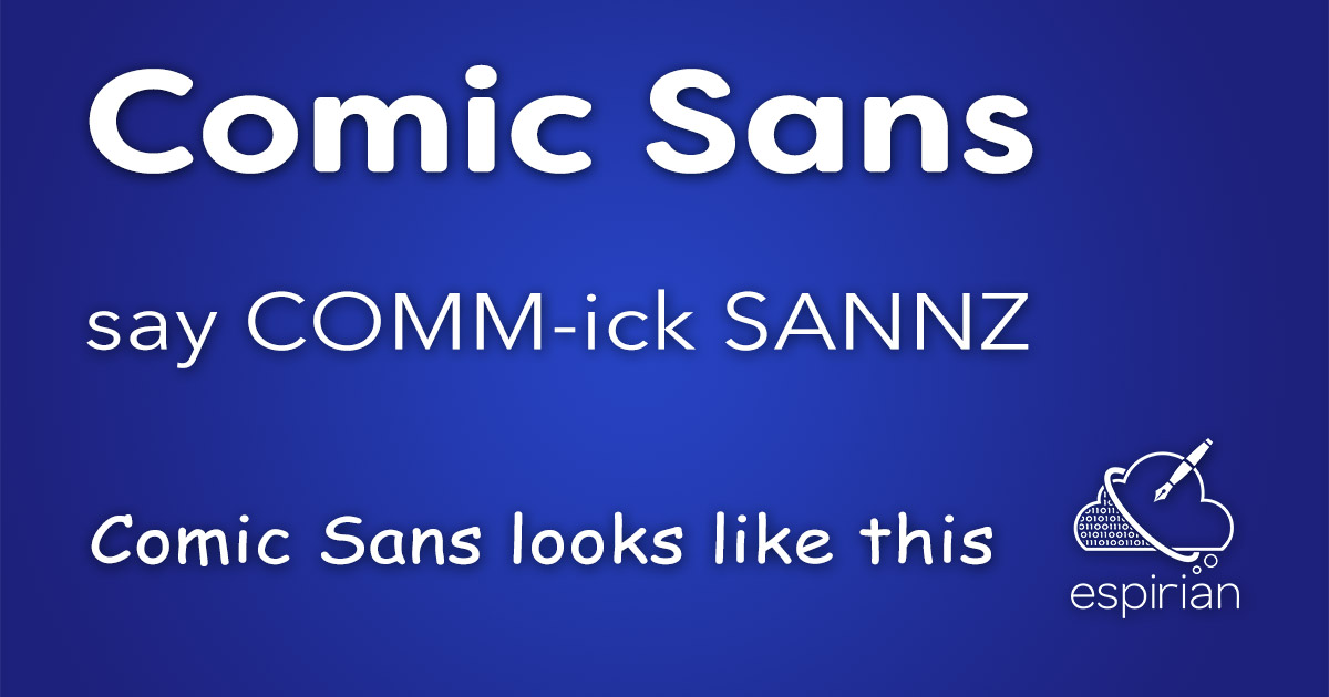
Or, as I sometimes call it, Chronic Sans. Note that a lot of people really hate Comic Sans, so it’s best avoided unless you intend to use it ironically.
Say it as COMM-ick SANNZ.
The “Sans” part means the typeface has no serifs (small visual flourishes on the characters in a typeface).
Bonus tip: typeface versus font
You’ll probably think that the names I’ve given above are fonts. They’re actually typefaces.
The typeface is simply the name of the design of the characters. The font is the typeface and its size and weight.
Example: the typeface is Avenir.
Example: the font is 12pt bold Helvetica.
Do you know any confusable typeface names?
Let me know by leaving a comment below, or catch up with me on Twitter. I’d love to hear from you.