
Quick wins and slow burns to make your website look and perform better
Is your website a bit tired and in need of a spruce up? I’m going to give you some straight advice on how to improve the performance of your website.
- Introduction
- Quick wins to improve your website
- Increase the size of your text
- Decrease the size of your logo
- Use two main typefaces
- Write fewer words
- Use short sentences and paragraphs
- Use bold for key words and phrases
- Use common menu names
- Use images responsibly
- Limit the colour palette
- Include a contact form and an email address
- Make use of the footer
- Check the speed of your website
- Make a clear call to action
- Slow burns to improve your website
- Include testimonials and case studies
- Talk about pricing
- Think about brand identity
- Put some personality into your About page
- Talk to one specific reader
- Ask a human to test your site
- Edit or rewrite using the right keywords
- Use Google Analytics
- Collect email addresses
Need help with your site?
Do you have questions about setting up or improving your website? Book a video call and let me help you.
Introduction
Confession: I’m not a web designer. But I’ve reviewed and written enough website content that I’m fairly well placed to judge what works and what doesn’t for most business websites.
I’ve split the following tips into quick wins, which should take a matter of minutes, and slow burns, which could take many hours.
Quick wins
This set of tips can usually be done in a matter of minutes, so long as you have the necessary admin access to your site and aren’t afraid to make changes. If you’re not sure, ask your web developer to give you a hand.
⚡️ Increase the size of your text
The default size for text on the web is 16 pixels (or 16px), but your audience might appreciate a larger size.
A font size of 24px would be considered very large for body text, as this is a similar size to many headings. The UK Government website sets its body text at 19px (source). I use 20px for my body text.
Aim for:
- heading text size between
24pxand30px. - body text size between
16pxand22px.
Source: iA
⚡️ Decrease the size of your logo
A logo is a useful device to help your audience recognise your brand, but that doesn’t mean it should occupy a huge part of the screen.
Make it large enough to be visible but don’t let it dominate the page. Chances are your current logo could be made smaller onscreen without the reader being affected – they still know it’s you and you get more space to work with.
Keep your logo small and place it in the top-left corner of the page, as that should always be visible when the page loads.
⚡️ Use two main typefaces
A typeface is the name given to the visual style of a complete set of letters, numbers and characters. You’ll have heard of Times New Roman, Arial and Verdana. They’re all typefaces and are often called fonts (strictly speaking, a font is a typeface at a particular size, e.g. 14pt Arial).
Use one typeface for headings and another for body copy. Think very carefully before introducing a third typeface.
Your logo doesn’t count here, so don’t worry if that uses completely different text styling.
Remember that too many typefaces can make the content look confusing.
If you want to add non-standard typefaces to your site, you can use the free Google Fonts service.
If you’re looking for design advice on pairing typefaces, take a look at these free tools:
⚡️ Write fewer words
Don’t write any more than you need to.
The easiest approach is to write everything you can think of on the subject in question. Leave the text for a while and then come back to it, ready to cut out the unnecessary parts.
If there are words, phrases and sentences that don’t add anything of value, bin them.
Writing process:
1. Write everything you can think of. No filter, no fear.
2. Go away for a while.
3. With fresh eyes, edit without mercy.— John Espirian (@espirian) October 11, 2016
Don’t display a large ‘welcome’ note on your homepage. There are much better uses of your screen real estate, so ditch text that doesn’t add any value.
Bear in mind that long-form content can work well on blogs. On my own blog, posts that are 2000–3000 words work best. On the web in general, the most popular blog posts are around 1500 words long.
There’s more about ideal blog length here: How long should my blog posts be?
⚡️ Use short sentences and paragraphs
No one wants to read walls of text. Break up your content by using short sentences and paragraphs.
It's OK if a paragraph contains just one sentence.
And if that sentence contains just one word, that's OK, too.
Really.#writingtips
— John Espirian (@espirian) March 6, 2017
Remember that more and more people are browsing on mobile devices, where normal paragraphs look like walls of text. Keep it brief and break up the content as much as possible.
⚡️ Use bold for key words and phrases
Draw attention to the most important words in key paragraphs.
Be careful that you don’t go for bold overkill.
⚡️ Use common menu names
Fancy names in website navigation menus are about as cool as fancy names on toilet doors in restaurants (not cool at all).
Use familiar menu names such as About, Services and Contact.
The Contact item is usually the final item in a menu. It ought to be placed at the far right of a horizontal list or at the bottom of a vertical list.
⚡️ Use images responsibly
Good visuals will bring your writing to life, but remember that images take longer to download than text. Don’t add an image unless it serves a specific purpose.
Image carousels (where lots of images are shown in sequence) are out of fashion. Unless you’re in a highly visual business, ditch them.
Designer Col Gray has pulled together an excellent list of free stock photo sites here: 35 free stock photography website catalogues and libraries.
⚡️ Limit the colour palette
Unless you’re offering a product or service that’s highly visual by its nature, keep your colour palette restricted.
Use one primary colour and one secondary (accent) colour, plus grey.
⚡️ Include a contact form and an email address
Give people the option of using a contact form or emailing you direct.
About half of my client enquiries come via the form on my contact page, the other half from direct emails.
For WordPress users, I recommend the free Contact Form 7 plugin.
⚡️ Make use of the footer
When people are looking for contact details, social links and sitemap info, they might jump down to look at the footer. This content appears on every page, so make sure it’s filled with useful content.
It can take a while to get your footer right, but it shouldn’t take long to start improving it by adding relevant links and info.
⚡️ Check the speed of your website
Your audience will take a split-second to make a decision about your website. If it loads slowly, there’s a good chance that people will give up and move on before they read any of your content.
Check how well optimised your site is by using GTmetrix.
⚡️ Make a clear call to action
When you create a page, you should always think about what you want the reader to do once they’ve finished consuming the content. Should they:
- buy something?
- subscribe to a newsletter?
- read another page on your site?
- contact you to find out more about what you can offer?
If you want your readers to do any of those things, you should tell them as clearly as you can.
Perhaps you use a link, a special coloured box, a button, whatever. All of these are part of your call to action (CTA) – the clear route for the reader to take once they’ve finished with the current page.
Here’s an example CTA:
Many pages don’t have a clear CTA, so make sure that doesn’t happen on your site. Ask yourself ‘What’s next?’ and answer that for your readers by giving them an action to take.
(At the end of each of my blogs, for example, there’s a CTA for readers to join my Espresso ☕️ list so that they can hear more from me.)
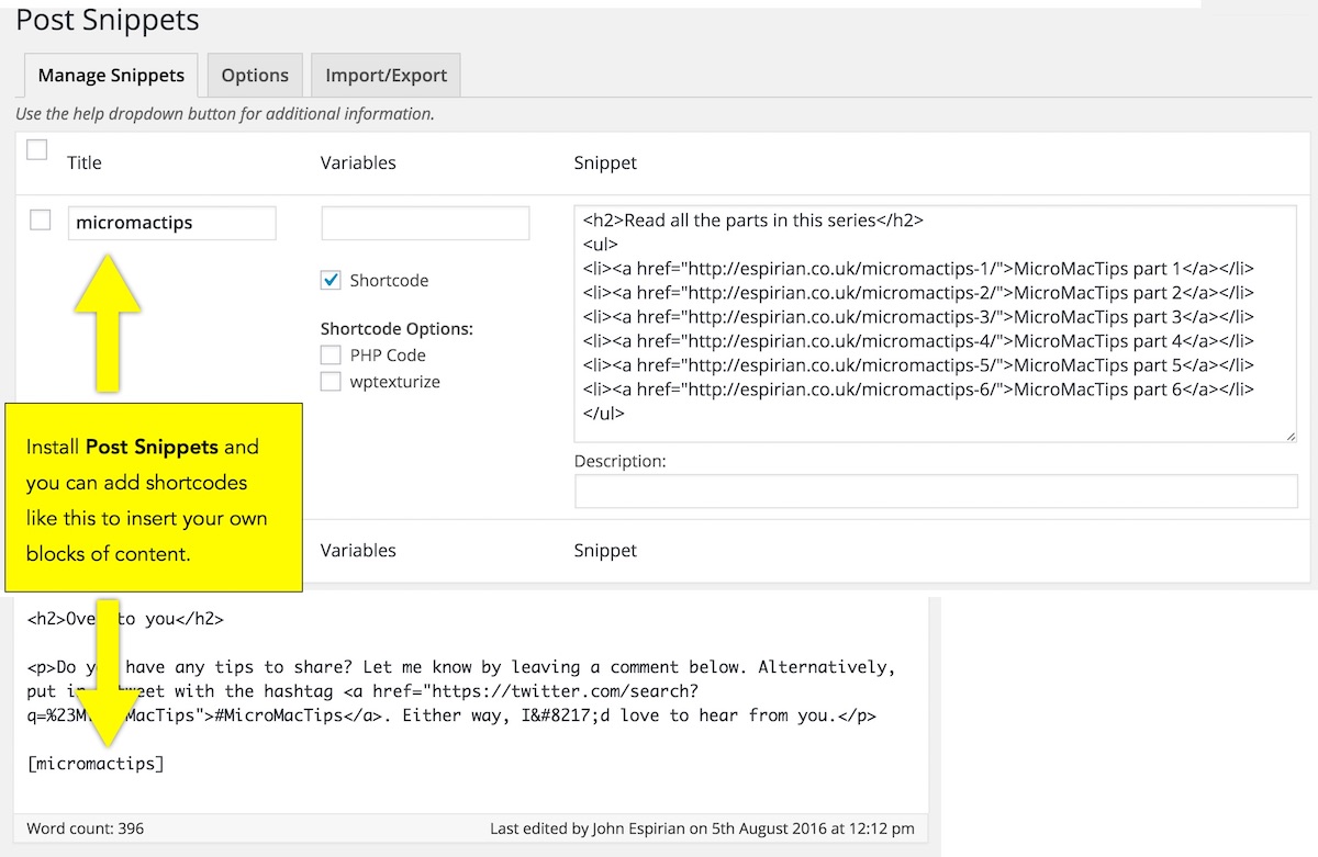
If you have blocks of content you want to reuse for CTAs and other parts of the page, use the free Post Snippets plug-in for WordPress. It lets you create custom shortcodes that you can drop in to your posts:
Slow burns
These tips will take a while to implement, but could really serve to improve the quality of your website. Again, speak to a web developer if you need a hand.
My go-to expert for web optimisation advice is Gill Andrews. She’s written a helpful post that you can use to speed up your site: How to make your WordPress site load faster.

Web consultant
Gill Andrews
There are many tips out there that may or may not work for your website. But there’s one surefire way to increase traffic for any website, and it’s to make it load faster.
If you haven’t optimized your website for speed, you’re leaving easy money on the table.
⌛️ Include testimonials and case studies
Ask your customers to write a couple of sentences about your product or about the service you provided to them. Include this feedback on a testimonials page (here’s mine).
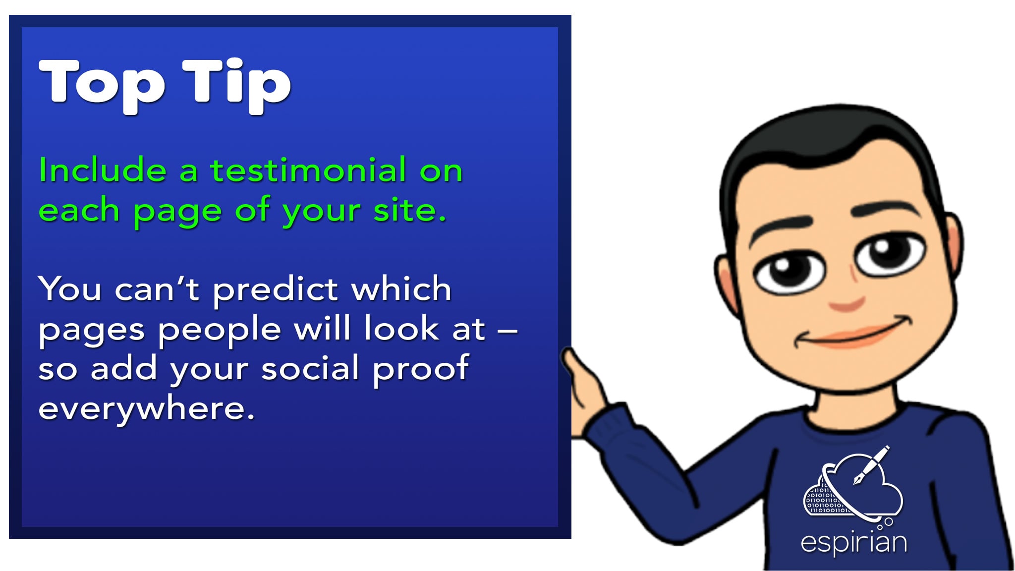
In addition, include a testimonial on each page of your website.
More testimonial tips:
- Ask for recommendations via LinkedIn first, then (with permission) copy these to your website.
- Ask for testimonials that mention specifics – what you did, how you helped and what results you achieved.
- Include a headshot of the testimonial-giver rather than their corporate logo.
- Don’t publish anonymous testimonials.
Remember that your readers could arrive at any page of your site. That means you have to hit them with convincing information as soon as you can, and that means spreading testimonials around your site. Speaking of which:

Fiction proofreader and copyeditor
Louise Harnby
John’s technical writing advice and social media marketing tips have helped colleagues and clients around the world to communicate their message clearly, concisely and compellingly.
Highly recommended.
Web expert Andy Crestodina recommends that you ditch your testimonials page entirely. He favours the one-testimonial-per-page approach. You can read more about this here: 15 Things To Remove From Your Website Immediately.
If possible, develop a testimonial into a full case study.
The more ‘social proof’ you can provide, the more you’ll build trust with the audience.
⌛️ Talk about pricing
If you sell a product or provide a service, you should be transparent about the factors that determine price in your business.
That doesn’t mean you need to quote hard figures – just be willing to discuss the subject of price, because you can bet that your potential clients will be interested in this information.
I’ve written more about pricing here: Pricing: a question of trust.
⌛️ Think about brand identity
What handful of words would you use to describe you and your business?
Forget about common terms such as ‘professional’ and ‘trustworthy’. These are things that every business should be.
Once you have a short list of words, think about how each of your web pages can demonstrate that those descriptions are true for you and your business.
For example, if ‘empathy’ is one of your chosen words, are you showing real empathy in understanding your customers’ problems? And are you doing that on every page?
Develop a clear idea of your brand and then apply that everywhere – on your website, in brochures, in emails, in videos, and so on.
Find out more by taking my 5-minute branding exercise:

⌛️ Put some personality into your About page
People do business with people, so give your audience something of interest on your About page. Include a little bit of personal information and a good-quality headshot of you (and your team, if appropriate).
⌛️ Talk to one specific reader
It’s important to know who your audience is and then gear your website to appeal to them. If you write for everyone, you’ll appeal to no one.
I’ve written about this in my pen portraits post. Work out who your ideal reader is, then produce something that they’d be interested to read.
This approach may take some time to implement, especially if you already have several pages on your website. But it’s one of the most important things you can do to improve your chances of success.
Remember: there’s no point having a website if it’s not relevant to your target audience.
⌛️ Ask a human to test your site
Ask for feedback from real users of your site. That could be your customers or, more likely, friends and colleagues.
Give them some specific tasks and questions so that you can compare the feedback they provide. For example:
- What is the site about?
- How quick was it to find pricing information?
- What stands out most on page X?
Ideally, watch your users carry out these tasks in person. They might struggle over something that you thought would be easy to do. Such insight could help you improve the user experience for others.
For the best results, hire a trained professional to give you detailed feedback. I recommend Martin Huntbach and Gill Andrews.
⌛️ Edit or rewrite using the right keywords
Think about what people search for when they look for a product or service similar to what you offer.
Are there words, phrases or questions you think they would be likely to type in to Google? If so, try to work those in to your content.
It may take a while to get this right and for it to have an impact on your standings in search results, but a long-term approach of writing relevant content that solves people’s problems and matches their search intent is a great way to get your site noticed.
Here are some good places to look if you need a hand developing keyword-rich content:
- Google search bar: when you start typing a search into Google, the autosuggest feature will display possible searches of interest. Enter questions about your business and see what related questions are suggested. Google pulls this data from real searches, so if you can write about those topics, you’ll have a chance of producing something of relevance to your audience.
- Google results page: at the bottom of Google’s search results page is a set of links for other related content. Again, search for terms used in your business and see what content ideas you can draw from the list of links at the bottom of the search results.
- KWFinder: a useful, free keyword research tool.
- Answer The Public: another excellent research tool (check out the old guy in the background video!).
You can find out more about my long-term approach to creating helpful content here: The 30-month mindset.
⌛️ Use Google Analytics
Google Analytics is a free service by Google that allows you to look at usage figures for your website. You can see which pages are most popular, how long each visitor spends on your site, where your visitors are based, and much more besides.
Here are some useful things to look out for:
- Time on site: the longer people spend on your pages, the more likely it is that Google will think of your site as providing something of interest. Think about how you can create content that keeps people engaged for longer. Embedded videos and interactive features could be a good option to investigate. Useful, relevant content is naturally engaging, so produce that and people will stick around.
- Bounce rate: that’s the percentage of people who visited only 1 page of your site before leaving. A high bounce rate tells Google that your site might not have been useful to the reader. Use good CTAs to give the audience a reason to click to view other pages on your site. This reduces your bounce rate, keeping Google happy. It also means people spend longer on your site, which improves the chances of them remembering you and wanting to do business.
- Popular pages: look at your best performing pages and create related content that helps to amplify its impact. Follow-up posts, ebooks and videos can be a good way to capitalise on content that’s already worked well for your audience. It’s often far easier, quicker and cheaper to improve existing content than it is to dream up new ideas for content that might end up not doing so well anyway.
⌛️ Collect email addresses
A great way to build a long-term relationship with people who look at your website is to give them an option to subscribe to your mailing list.
If you don’t have a mailing list, I suggest creating a free account with MailChimp. You can then grab a piece of code to include on your site that will allow your audience to sign up. Once that’s done, you can keep in touch with them by sending regular emails.
If you take this approach, make sure to send only relevant, helpful or otherwise valuable content to your subscribers. Being salesy or spammy is a good way to lose trust, so remember to respect people’s inboxes.
Let’s wrap up
These are just some of the ways you can improve your website. Many of the tips are quick and easy, so get cracking and see how you can make your site better.
Sometimes, you might need more strategic help with your site, e.g. what to write, how best to position your services.
There’s no ‘one size fits all’ answer for such things, but if you need support then check out my 1-to-1 consultation service.
Need help with your site?
Do you have questions about setting up or improving your website? Book a video call and let me help you.
Recommended reading
- The 30-month mindset
- How long should my blog posts be?
- 15 Things To Remove From Your Website Immediately – by Andy Crestodina
- 7 mistakes you’re making on your homepage and how to fix them – by Jammy Digital
- Interactive website review tool – by Gill Andrews
- How to make your WordPress site load faster – by Gill Andrews